This is a beautiful rebrand for the Co-Op by North. I’m a huge fan of brands looking back to their past to move forward. It was such a great identity and memorable image when we were growing up. A lot of the memories and equity that many people associated with the Co-Op will have been reinstilled without the company having to do any marketing at all. Brilliant move by the Co-Op and great work by North. Now, if we can just get United to go back the Tulip logo…


This rebrand of the English National Ballet ditches the previous ornamental flourishes and replaces them with a brutally modernist logo that doubles as a quote mark and a ballerina’s feet ‘en pointe’. A timeless idea that feels really appropriate; tying in with the ENB’s positioning as the voice of ballet. The crown in the identity are the advertising shots in collaboration with Vivienne Westwood – quintessentially British but with a sense of danger and sexiness.


A clever approach to a sensitive subject. The identity for the Australian Cancer Research Foundation by RE: visually embodies the charities unmitigated purpose — to help make cancer disappear.
A custom typeface with characters of varying weights represents how some cancers are close to disappearing, while others remain all too visible. Supporting the type is a series of strong statements that call out the end of cancer and subsequently the organisation itself.


This visually stunning campaign reflects how a clever idea enhances the brand’s appeal with boundless imagination. A great example of art direction at it’s best.


One of the most important aspects about a good idea is consistency, especially when it comes to art direction. The Frieze Art Fair campaigns by GTF have shown that a simple idea can be told in many ways. A contemporary view on the life of Queens Park (where the Fair takes place) is a very simple idea, yet every year they have managed to surprise us. This is a compilation of some of my favorite Images.


I still remember these posters hanging on the walls of travel agencies, long before the internet existed and flying was still a matter of quality. Georg Gerster was the aerial photographer of the Swissair advertising posters for over two decades (1971-79). A simple, clever and effective idea that promotes the beauty of our planet in images of a timeless zeitgeist: a picture is worth a thousand words. Legendary. Series designed by Karl Gerstner in 1979.


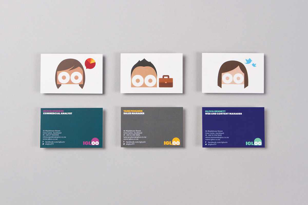
What I love most about this delightful identity is that Interbrand embraced one of the oldest visual clichés ever – a double-O turned into eyes – and made it fresh. Bold, relevant, revelling in both the visual and the verbal: this is how branding should be.


Beautifully crafted idea by Interbrand Sydney for the Sydney Opera House. Sail shaped blends interacting with photography and 3D typography all reference back to the iconic shape of the building. It’s a superb brand language working cohesively with the lovely symbol. So unique and ownable by this particular Opera House. More images and motion graphics can be seen here on Interbrand’s site.


