Brand identity and environmental work by Common Curiosity for The Tubeworks — a former tube and pipe manufacturing factory, now working spaces for businesses in Digbeth, Birmingham.
A bygone visual language of tubes provides a perfect metaphor for building connections and a 'T' shaped symbol.
This is elevated even further with wonderfully original three dimensional tube signage.


On first seeing the logo and the tap, I thought "that's lovely", along with the ® symbol placement – another very nice detail. On further reading I found out that the name is derived from the tap 'flipping' between delivering hot, cold, filtered, sparkling and boiling water. Then I loved it even more.
Visit Red Dot Studio's website here.


Refractory is a furniture, lighting and object design studio based in Chicago. Refractory reflects a distinctly contemporary American design approach. One that is born of the spirit of the American West. The typography, graphic language and style really feels Wild West but in a modern way. The clever use of the upside down R to create the Y is reminiscent of forgery and riding equipment. It's such a beautifully simple idea that fits the client perfectly and is immaculately crafted, down to the tiniest detail.


This is a lovely identity overall, but it's that achingly perfect mark that stands out. It’s such a fun concept, executed with exquisite precision – without losing any of its energy or life. No mean feat. I could just sit and stare at that G for an unhealthy amount of time.


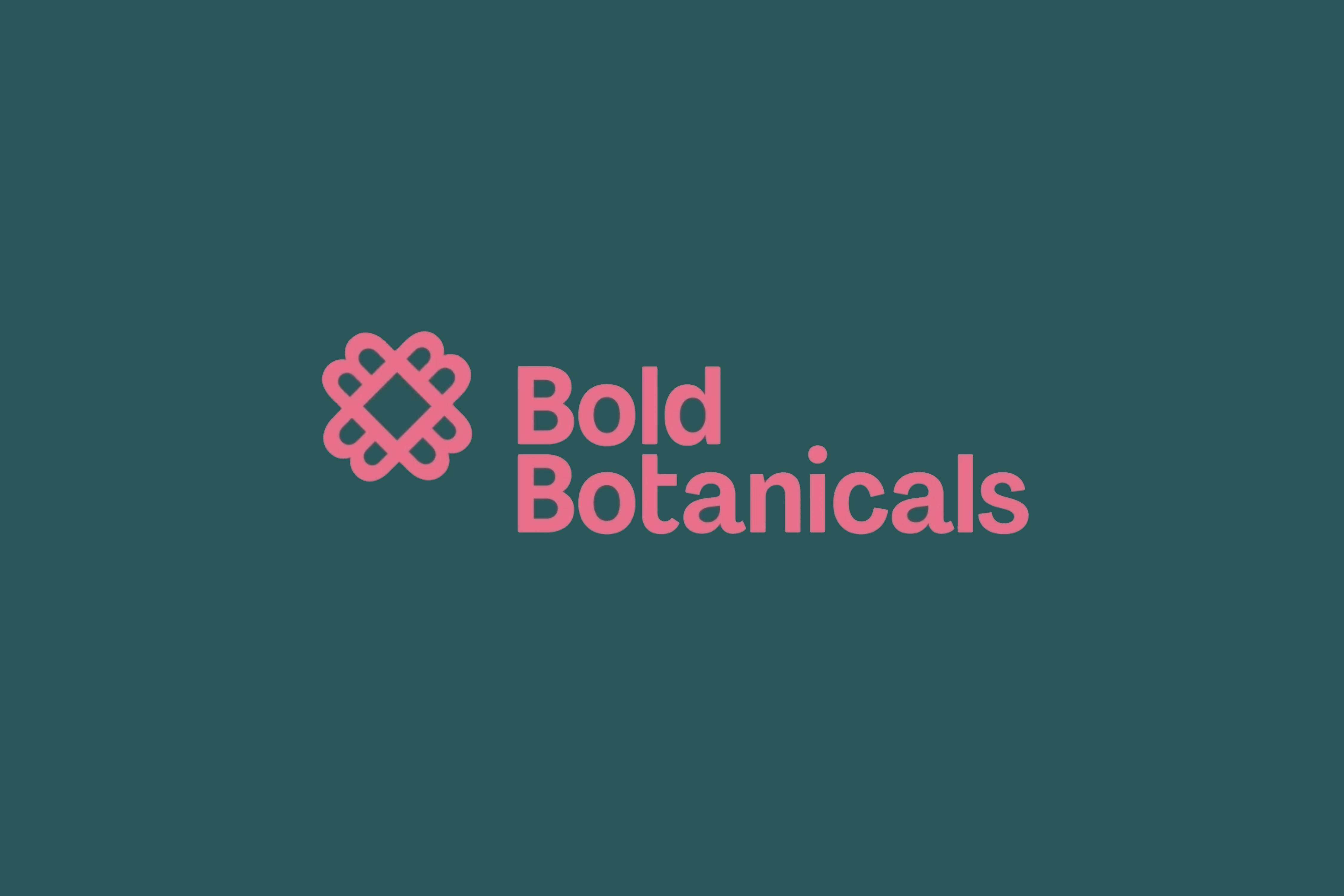
Teaser of a new project by Design by Toko, an identity for Australia-based floral purveyor and designer Suzanne Robbins and new venture called Bold Botanicals. The symbol uses a letter 'B' rotated to form a flower shape.


One of those chef's-kiss logo ideas that requires no explanation. And a sharp, simple identity system built around it. Classic.


Say it how it is. This is exactly what I would want the juice, in fact everything in my refrigerator to look like. Solid color and beautiful typography. Ragged Edge built an extremely ordinary packaging system for extremely ordinary juice. Without saying anything it exudes freshness and taste. Brilliant idea, beautifully crafted.


