I love a clever word mark almost as much as I love Bath. Supple Studio have created a charming identity for a coffee shop in Bath, UK. Their mission is to make good coffee accessible to everyone – specialty coffee without the pomp. Clever solutions such as these definitely appeal to the mass consumer. They make you smile and create an immediate emotional connection with the public. Using the illustrations to highlight the hidden cups creates a playful and extremely accessible visual language. Perfect work Jamie and team.


Logo R.I.P is a self-initiated project by The Stone Twins, commemorating iconic logos that have been lost at the turn of the 21st century.
It features international design classics such as AT&T (Saul Bass), British Steel (David Gentleman), NASA (Danne & Blackburn) and PanAm (Chermayeff & Geismar).
Rediscovered this project by GBH (now Our Friends) from 2012 for Mama Shelter, a chic, eclectic hotel group with an 'off-beat vibe'.
The branding takes an unconventional approach. Playing off the name “Mama”, a hen is used as a marque where the space between its legs form the shape of an egg. Hen imagery is carried though to other collateral, including leg tags for each location.


A perfect concept that needs no explanation from me. I’m a sucker for this sort of negative-space concept, and this one works so perfectly it gives me an ache in the chest. Beautiful.


Lovely identity by Vietnamese branding studio M — N Associates for Saigon coffee chain Guta. The street-style coffee shops are known for their small plastic chairs. Their identity leverages this with a custom wordmark, typeface and illustration inspired by the form of their chairs.


A beautifully simple, charming identity to meet one of those briefs that might easily feel overwhelming. Balancing respect for the heritage with a playful lightness of touch is an incredibly delicate business. Manual have pulled it off magnificently. That curious e is a masterstroke.


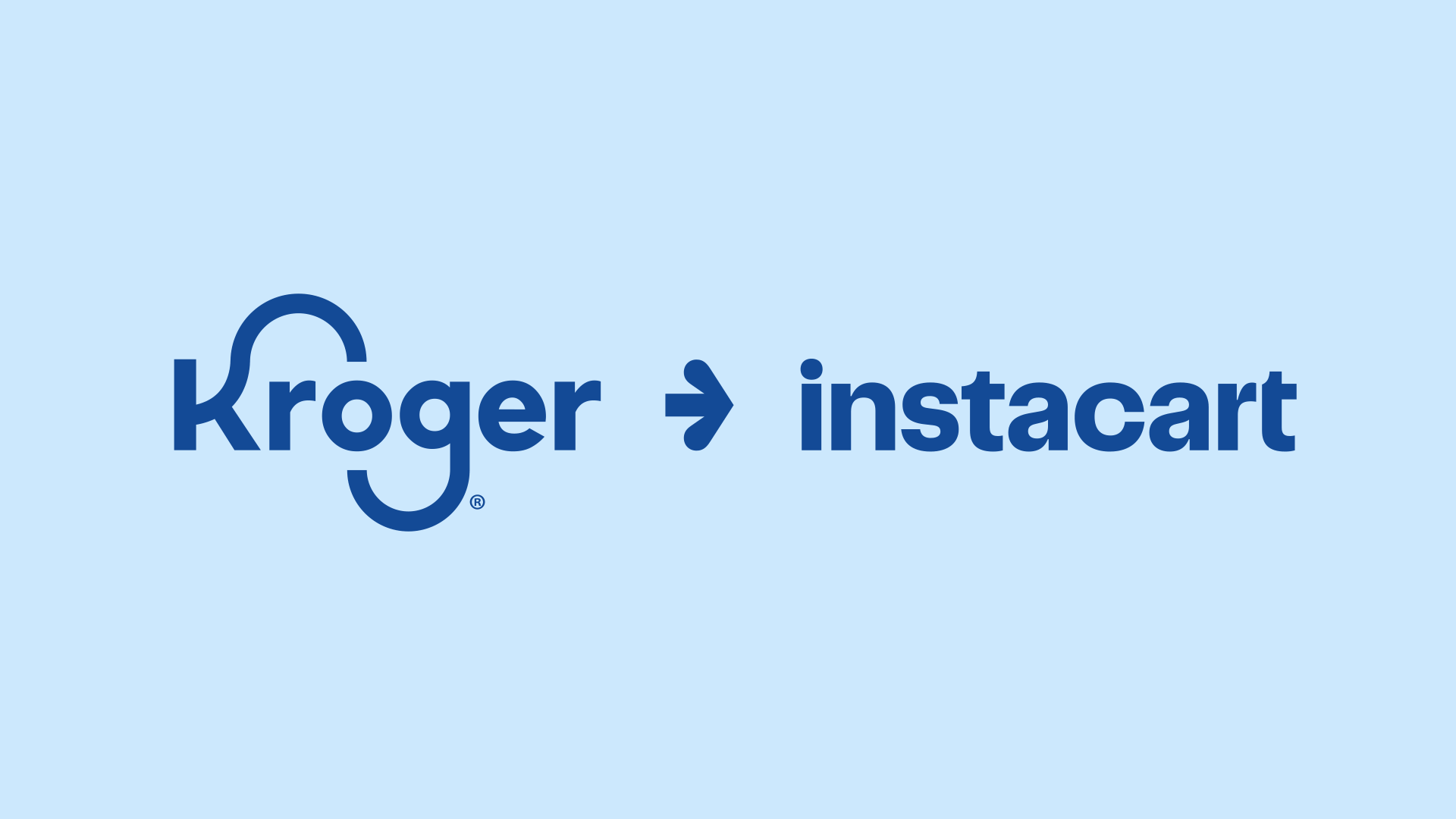
Smart rebrand for Instacart by Wolff Olins in collaboration with Instacart's internal team that brings new meaning and design finesse to their carrot symbol. The application examples so far tease some nice moments for how the new logo and brand system could roll out. Learn more here.


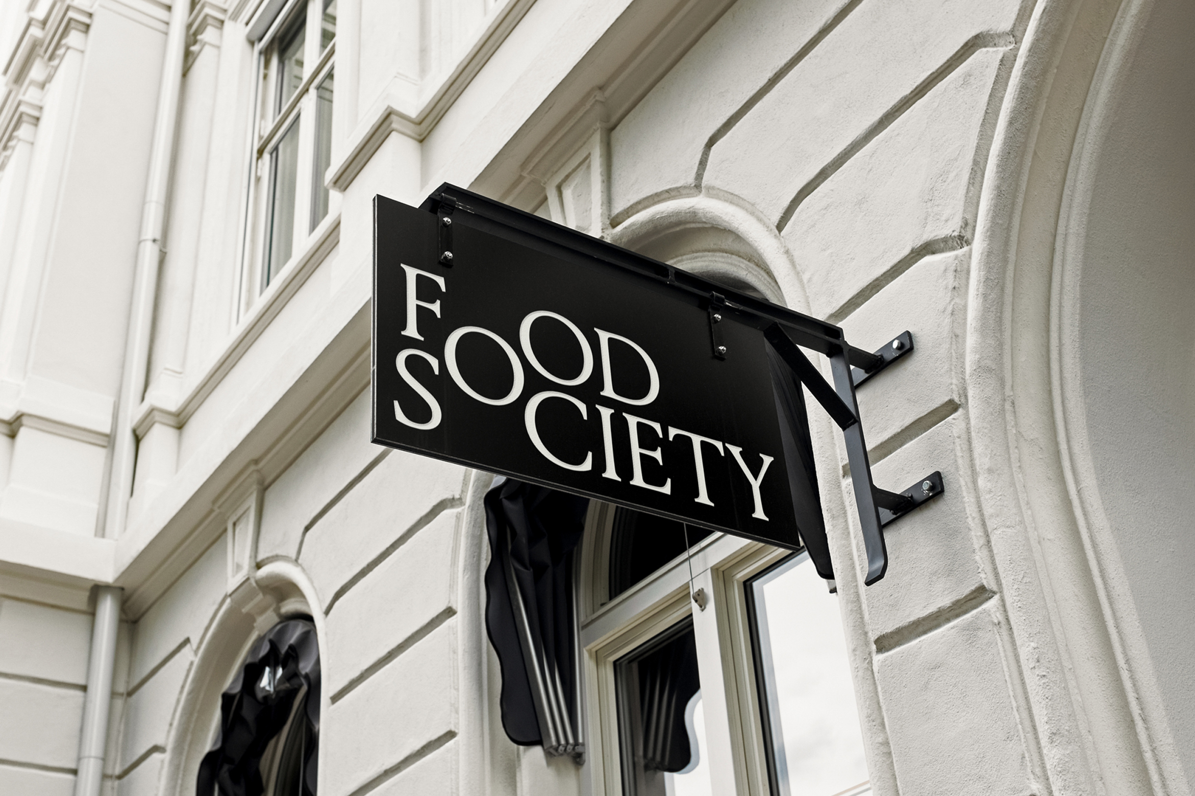
A simple idea executed well by Bleed. The Food Society logo embodies the idea of community; the collective ‘O’ represents the shared point where different kitchens come together under one roof in Norway's only “dine-in-first” restaurant concept.